Best Apple Watch Face for Seniors: Large Text & High Contrast
Find the best Apple Watch face for seniors. Maximize visibility with high-contrast layouts, large text dials, vital health metrics, and easy watchOS settings.
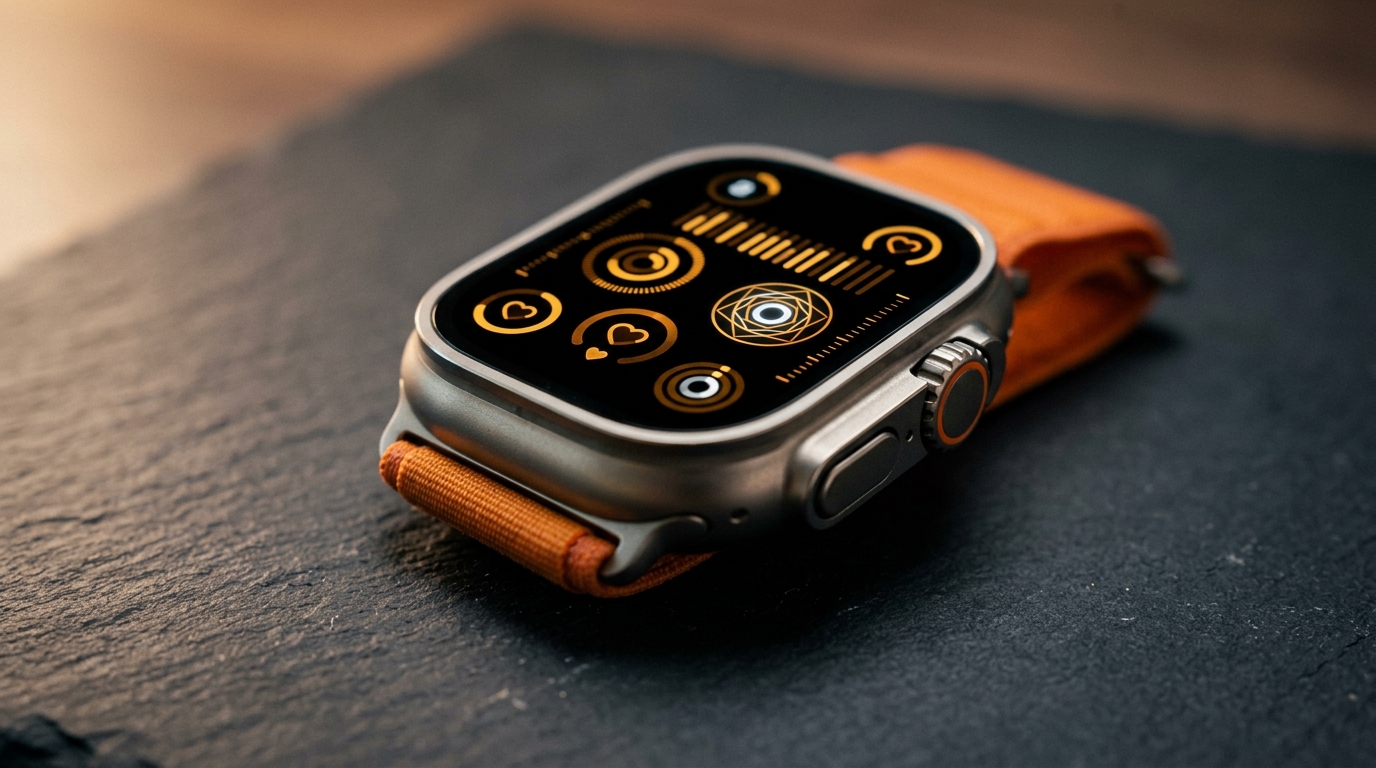
Small typography and complicated multi-dial layouts often turn an otherwise life-saving wearable into an exercise in visual frustration. For older adults, retirees, and individuals living with presbyopia or changing eyesight, wrist technology must deliver immediate legibility rather than complex data clutter. Selecting the best apple watch face for seniors requires balancing crisp typographic scale, high-contrast color palettes, and immediate access to critical health complications like heart rate and medical alerts.
When configured with deliberate accessibility settings and legible typography, watchOS becomes an effortless daily assistant. This guide breaks down the most visible watch faces, essential health complications, and hardware adjustments to create the ultimate high-contrast watch setup.
Why Choosing the Best Apple Watch Face for Seniors Matters
Wrist screens present distinct visual ergonomics compared to tablets or smartphones. An Apple Watch display measures between 40mm and 49mm diagonally, meaning information is viewed from dynamic angles, varying distances, and unpredictable ambient lighting conditions ranging from harsh midday glare to dim bedside corridors. For aging eyes, pupils dilate more slowly and optical contrast sensitivity declines significantly. Tiny circular gauges, pastel gradients, and crowded three-column complication rows demand unnecessary cognitive strain and prolonged wrist-raise time.
The best apple watch face for seniors eliminates peripheral visual noise. Instead of competing for attention with seven miniature complication rings, an accessible watch face prioritizes high luminance contrast—ideally pure white or vivid amber figures set against an absolute OLED black background. On modern displays like the 45mm Series 9, the 46mm Series 10, or the 49mm Apple Watch Ultra 2, wide viewing angles and edge-to-edge glass offer substantial digital canvas space. However, screen real estate only benefits seniors when typography scales generously rather than being packed with secondary data points.
Moreover, readability directly impacts personal safety. When an individual experiences sudden dizziness, arrhythmia, or a balance slip, searching through tiny submenus to check pulse rate or trigger assistance is impractical. A clean watch dial acts as a glanceable health dashboard where pulse rate, outside conditions, and emergency shortcuts remain legible without reaching for reading glasses.
Top High-Contrast Watch Faces for Maximum Readability
Apple includes dozens of customizable watch faces in watchOS, but only a select few satisfy rigorous accessibility criteria for high contrast and oversized text. Here are the premier choices for senior usability.
1. X-Large: Uncompromising Typography and Zero Clutter
The X-Large face represents the gold standard of senior accessibility on watchOS. Designed with an oversized digital font that spans the entire vertical height of the Retina display, it transforms the Apple Watch into a bold, bold-numeral timepiece that can be deciphered from several feet away.
In its default configuration, X-Large displays the current digital hour and minute stacked vertically in massive block digits. Users can also configure a single center complication slot, replacing the stacked digits with a slightly scaled digital clock alongside a prominent weather readout, battery percentage, or heart rate figure. Setting the color palette to White, Cream, or High-Contrast Yellow on an OLED black background maximizes luminance separation.
- Preserved Benefit: Provides massive 40-point plus typography that remains readable across the room or while walking, requiring zero squinting or magnification.
- Explicit Trade-Off: Restricts the watch face to a single data complication slot, removing simultaneous access to secondary widgets like activity rings or multi-day forecasts.
2. Modular: Dense Health Data with Clear Focal Points
For seniors who require active daily health monitoring without sacrificing legibility, Modular remains the top multi-metric choice. While poorly configured Modular setups can quickly become overwhelming, a deliberate layout solves the visibility challenge by pairing digital time with an expansive rectangular middle complication.
By assigning the large center complication to a continuous vital reading—such as cardiovascular data or an oversized weather summary—seniors gain detailed information in clear, legible text lines rather than cramped circular dials. The bottom three complication slots can be left empty to minimize visual clutter or dedicated to single-tap shortcuts like Phone and Messages. For an in-depth breakdown of configuring modular complication slots, explore our Apple Watch Complications Guide: Layouts, Slots & Best Setups.
- Preserved Benefit: Displays real-time cardiovascular telemetry, outdoor ambient conditions, and battery status simultaneously on a structured grid.
- Explicit Trade-Off: Requires initial curation to hide redundant small dials; careless slot filling increases visual clutter and cognitive strain.
3. Numerals Duo & Numerals Mono: Crisp Geometric Digits
Numerals Duo and Numerals Mono deliver clean, modern Scandinavian-inspired typography that combines high aesthetic polish with superior legibility. Numerals Duo fills the entire display with two large two-digit numerals representing the current hour and minute, rendered in solid, open-counter typefaces.
Because there are no decorative ticks, circular bezels, or sub-dials, visual attention remains focused entirely on the time. Seniors who find traditional analog watch hands ambiguous or difficult to align against tiny minute markers appreciate the unequivocal clarity of massive digital Arabic numerals. Choosing the Solid font style with contrasting foreground tones ensures readability across bright sunlight and dark indoor environments.
Essential Complications for Senior Health and Peace of Mind
A watch face is only as powerful as the complications it displays. For older adults, complications should prioritize biological health metrics, environmental safety, and personal security over social media alerts or stock market tickers.
Real-Time Cardiovascular Tracking on the Wrist
Continuous pulse tracking offers crucial peace of mind for seniors managing hypertension, atrial fibrillation, or cardiovascular wellness. Having pulse telemetry directly on the main dial prevents the need to open menus or navigate apps during moments of fatigue or exertion.
Faces like Vitals Heart Rate place live pulse measurements directly in the visual center, surrounded by clean activity rings and battery status indicators. For seniors who prefer a dedicated biometric dial with instantaneous updates and resting metrics, Live Heart Rate provides bold, high-legibility cardiovascular telemetry designed for instantaneous verification.
Glanceable Weather and Ambient Environmental Alerts
Environmental conditions pose real risks for seniors, particularly during extreme summer heatwaves or freezing winter mornings. Sudden temperature shifts can worsen joint inflammation, while high UV indices or sudden precipitation increase dehydration and fall hazards on wet sidewalks.
Integrating Weather Simple into your watch layout provides immediate, high-contrast readings of outside temperature, severe weather alerts, and hourly forecasts. Presenting meteorological conditions with bold numerical temperatures and high-contrast iconography ensures seniors dress appropriately before heading outdoors.
Fall Detection, Emergency SOS, and Rapid Medical Telemetry
While watch faces display day-to-day metrics, their underlying integration with watchOS safety hardware provides life-saving protection. Fall Detection uses onboard accelerometer and gyroscope sensors to identify hard impacts, initiating an emergency countdown if the wearer remains motionless for approximately one minute.
Pairing an accessible watch face with an emergency contact complication ensures immediate access to Medical ID telemetry, blood type data, and emergency calling. For step-by-step instructions on configuring emergency contacts, fall alerts, and wrist medical cards, read our comprehensive guide on Setting Up Medical ID and Emergency Features on Apple Watch.
Complete watchOS Accessibility Checklist for Seniors
Selecting the best apple watch face for seniors is only the first step. To ensure the entire operating system remains easy to navigate, apply these system-wide watchOS settings directly on the watch or through the iPhone Watch app.
Text Size and Bold Typography Settings
By default, watchOS uses dynamic type that scales conservatively to fit small buttons. Increasing system text weight and size significantly enhances readability across built-in apps and notifications.
1. Open Settings on the Apple Watch. 2. Navigate to Display & Brightness. 3. Tap Text Size and turn the Digital Crown clockwise to increase the font slider to its maximum level. 4. Return to Display & Brightness and toggle Bold Text on. A brief restart applies heavier font strokes across the entire UI.
- Preserved Benefit: Increases stroke contrast and letterform separation across system notifications, Messages, and complication titles.
- Explicit Trade-Off: Longer complication titles and calendar appointment names will truncate slightly sooner on 40mm and 41mm watch cases.
Contrast Enhancement and Transparency Reduction
Modern watchOS interface designs use translucent frosted glass layers that allow wallpaper accents to blur beneath system menus. While visually stylish, this background translucency reduces text contrast for seniors.
1. Open Settings on the Apple Watch. 2. Select Accessibility. 3. Tap Increase Contrast and switch the toggle to On. 4. Scroll to Reduce Transparency and enable it to replace blurred backgrounds with solid dark backdrops.
- Preserved Benefit: Maximizes optical text contrast by eliminating semi-transparent background noise behind alert sheets and menu cards.
- Explicit Trade-Off: Disables translucent background blurs, creating a flatter, strictly functional aesthetic throughout watchOS.
Optimizing Always-On Display for Effortless Viewing
For users with limited mobility or joint stiffness, having to sharply raise or flick the wrist to illuminate the display can be frustrating. The Always-On Retina display keeps the watch face legible continuously while resting on a table or in the lap.
To optimize visibility without unnecessary battery consumption: 1. Open Settings > Display & Brightness > Always On. 2. Ensure Always On is toggled On. 3. Under Hide Complication Data, choose whether sensitive medical metrics remain concealed when the wrist is down.
For strategies on balancing continuous display visibility with multi-day battery runtime, consult our guide on How to Maximize Apple Watch Battery Life on watchOS.
- Preserved Benefit: Eliminates the physical need to raise or rotate the wrist to check the time or view critical health complications.
- Explicit Trade-Off: Increases continuous OLED power draw, reducing overall daily battery autonomy by approximately 15 to 20 percent.
Simplifying Navigation with the List View App Layout
The default watchOS honeycomb app grid relies on microscopic circular icons without accompanying text labels. Seniors frequently struggle to tap or distinguish tiny icons.
1. Open Settings on the Apple Watch. 2. Tap App View. 3. Select List View.
List View organizes every installed watch application into an alphabetical, vertical scrolling list complete with large app icons and explicit bold text titles, making app navigation effortless.
Key Takeaways
- Prioritize High Luminance Contrast: Choose watch faces with stark white, bright yellow, or amber numerals against a pure black background to maximize legibility for aging eyes.
- Rely on Proven Layouts: The X-Large face provides unmatched scale for time and single-metric focus, while Modular delivers organized health data via its generous central complication slot.
- Monitor Vital Signs: Keep real-time cardiovascular telemetry front and center using complications like Vitals Heart Rate or Live Heart Rate.
- Activate System Accessibility: Always enable Bold Text, maximize the Text Size slider, and turn on Increase Contrast in watchOS settings to ensure system-wide clarity.
- Switch to List View: Replace the confusing honeycomb icon grid with the alphabetical List View for stress-free app selection.